

10 Best Font Combinations for Logos, Branding and Creative Projects
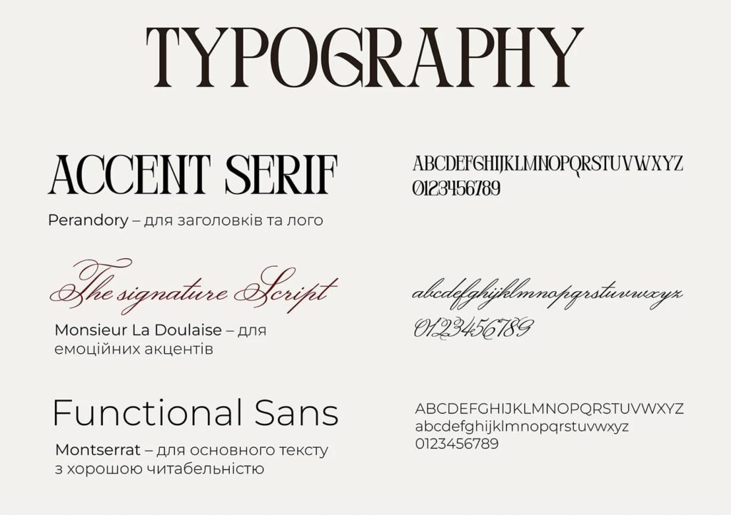
Choosing the right fonts can make a big difference in how your design looks and feels. A good font combination helps you create a clear visual hierarchy, highlight your message, and give your project a more professional and consistent appearance.
Whether you are designing a logo, building a website, creating social media graphics, or preparing printable materials, the right typography can help your work stand out.
In this guide, you’ll discover 10 versatile font combinations, practical tips for pairing fonts, and advice on choosing typography that fits your creative project.
Why Font Combinations Matter
Fonts do more than display text. They influence how people perceive your brand, set the mood of your design, and help communicate your message.
A well-chosen font combination can:
- Create a clear visual hierarchy.
- Make your design easier to read.
- Add personality to your brand.
- Keep your visual identity consistent.
- Give your project a more polished appearance.
Using two complementary fonts is often more effective than combining several unrelated styles. In many projects, one font for headings and another for body text is all you need.
10 Best Font Combinations for Creative Projects
The following combinations are useful starting points for logos, branding, websites, social media graphics, invitations, and other design projects.
1. Playfair Display + Montserrat
Best for: Elegant branding, lifestyle blogs, beauty businesses, and editorial designs.
Playfair Display brings a sophisticated serif style, while Montserrat offers clean, modern lettering. Together, they create a balance between elegance and clarity.
Use Playfair Display for headlines, brand statements, or featured quotes. Use Montserrat for body text, buttons, labels, and supporting information.
2. Poppins + Lora
Best for: Personal brands, creative agencies, blogs, and educational content.
Poppins has a geometric, contemporary appearance. Lora adds a more traditional editorial feel, making the pairing suitable for designs that need to feel both modern and approachable.
Try Poppins for headings and navigation, with Lora for longer text or storytelling sections.
3. Raleway + Open Sans
Best for: Websites, portfolios, presentations, and business materials.
Raleway has a distinctive modern style that works well for headings. Open Sans is designed for comfortable reading across different screen sizes.
This combination is particularly useful when you want a professional design without too much visual decoration.
4. Great Vibes + Montserrat
Best for: Wedding invitations, event stationery, beauty brands, and elegant promotional graphics.
Great Vibes is a decorative script font that adds a personal, handwritten feel. Montserrat balances it with a clean and structured appearance.
Use the script font sparingly for names, short phrases, or decorative headings. Keep essential information in Montserrat so that your design remains readable.
5. DM Serif Display + Poppins
Best for: Premium products, fashion brands, editorial graphics, and modern creative businesses.
DM Serif Display creates strong, expressive headlines, while Poppins provides a clean supporting style.
This pairing works well when you want a design that feels distinctive without becoming difficult to navigate.
6. League Spartan + Source Serif 4
Best for: Bold headlines, posters, magazine layouts, and educational graphics.
League Spartan has a strong, confident appearance that works well for large headings. Source Serif 4 adds a more traditional reading style.
Use League Spartan for short statements and titles, then use Source Serif 4 for paragraphs, explanations, and longer content.
7. Abril Fatface + Lato
Best for: Fashion campaigns, product packaging, creative portfolios, and magazine-inspired designs.
Abril Fatface makes a strong visual statement. Lato is more understated and helps keep the overall layout balanced.
Because Abril Fatface is visually prominent, it usually works best for short headings rather than large blocks of text.
8. Dancing Script + Open Sans
Best for: Handmade products, invitations, personal blogs, and friendly social media content.
Dancing Script gives designs a casual, handwritten character. Open Sans keeps the supporting text simple and readable.
This combination is a good option for creative projects that should feel personal, warm, and approachable.
9. Cinzel + Montserrat
Best for: Luxury-inspired branding, formal invitations, premium product graphics, and event materials.
Cinzel has a classical, inscription-inspired style. Montserrat introduces a more contemporary visual element.
Use Cinzel for short headings or names, and Montserrat for details, descriptions, and supporting text.
10. Caveat + Nunito
Best for: Planners, educational worksheets, lifestyle content, and playful creative projects.
Caveat has a handwritten appearance, while Nunito feels rounded and friendly.
The combination can work particularly well for informal designs, but make sure the handwritten font is large enough to read comfortably.
How to Choose the Right Font Combination
Not every attractive font pairing will suit every project. Before choosing fonts, consider the purpose of your design and the people who will see it.
Match the Fonts to Your Brand
Think about the feeling you want to communicate.
- Professional and modern: Try clean sans-serif fonts.
- Elegant and traditional: Consider serif fonts.
- Personal and creative: Use a script or handwritten font as an accent.
- Bold and energetic: Choose strong display fonts for short headings.
The goal is to select typography that supports your message rather than distracts from it.
Combine Contrast with Consistency
Contrast makes it easier to distinguish headings from supporting text. You can create contrast by combining serif and sans-serif fonts
